Vastly increased concentrations of carbon dioxide in the atmosphere are wreaking havoc with the earth’s climate system, but few have seen what this invisible gas looks like.
NASA scientists developed a computer model that’s among the highest resolution ever achieved, and for the first time it shows in fine detail how carbon moves through the atmosphere.
The supercomputer uses data from measurements taken from the ground and after 75 days of crunching it produces a simulation, which NASA compressed a year’s worth data into the three-minute video below.
You can see plumes of carbon swirling and shifting as winds disperse the greenhouse gas away from its sources. Notice that almost all the carbon emissions originate in the Northern Hemisphere – and you’ll see distinct swings in global carbon concentrations as plants absorb carbon in spring and summer and then release it in the fall and winter.
"As summer transitions to fall and plant photosynthesis decreases, carbon dioxide begins to accumulate in the atmosphere," explains Bill Putnam, the NASA climate scientist who narrates the video. "Although this change is expected, we’re seeing higher concentrations of carbon dioxide accumulate in the atmosphere every year. This is contributing to the long-term trend of rising global temperatures."
Called "Nature Run," it also simulates winds, clouds, water vapor and airborne particles such as dust, black carbon, sea salt and emissions from industry and volcanoes.
Much remains unknown about how carbon moves from an emissions source to the atmosphere or to carbon sinks such as oceans and forests. Computer modeling will help scientists better understand the processes that drive carbon concentrations and project future changes to our climate.
And they will have lots more information to work from soon. For decades, scientists have been measuring carbon levels from the ground, but now they are also measuring it from space for the first time.
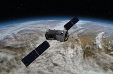
In July, NASA launched the first satellite into space dedicated to measuring carbon levels in the atmosphere, the Orbiting Carbon Observatory-2 (OCO-2). It will provide 100,000 high-resolution measurements across the world every day and preliminary data shows that measurements are exceeding expectations. Scientists expect to release their initial estimates of atmospheric carbon dioxide concentrations in early 2015.
OCO-2 is measuring how carbon sources and carbon sinks are distributed around the globe and how they change over time.

Watch the video!
The colors represent a range of carbon concentrations, from 375 parts per million (dark blue) to 385 (red) to 395 (light purple). White plumes represent carbon monoxide emissions. The data is from ground measurements taken in 2006, turned into a simulation by new computers which can produce extremely high resolution models. Unfortunately, carbon levels are much higher now, crossing the 400ppm threshold last year for the first time.
Also, watch NASA’s regional videos which hone in on North America, Asia, and southern Africa:
The video is a computer simulation not developed from the new satellite and prepared a while ago. And full of errors, as is the case with all computer models made from guesses.
Too bad you have to print this without a rudimentary fact check.
@Johnboy – I bet you deny the moon landing, mars curiosity landing, and numerous other achievements made through modern science, NASA and other space agencies around the world. It’s also based on past weather patterns, hence, the world model.
@username- Johnboy is correct, the video’s data is from 2006. OCO-2 was launched in July 2014, so obviously not a year’s worth of data yet. This is a misleading article starting in the second paragraph. The author states that NASA has released the first video from OCO-2, then he goes on to discuss the simulation video.
Color range is 375 ppm to 395 ppm. So, the total range of the change in concentrations shown in the video is 0.002%? Amazing that this small of a variation creates so much concern. Or is there something here that I just don’t understand?
Hi Curious, while the difference may seem small, it’s similar to humans having a fever. 96.7 is normal, but if it rises to 101 you’re sick and if rises to 103, you’re even sicker. Pre-industrial carbon in the atmosphere was 270 parts per million and for the last two years, we crossed 400 ppm for the first time – very dangerous levels of carbon. Look up 400 ppm in our search engine and you’ll find articles we’ve written about it.
thank you for your comments – I too, found it confusing and went back and revised the article after speaking with NASA.