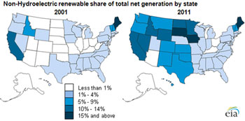
This map shows what a decade of renewable energy growth in the US looks like.

Compiled by the US Energy Information Administration, the map shows the results of Renewable Portfolio Standards (RPS) that are now law in 30 states and Washington DC. Federal production tax credits (PTC) and grants also contributed to the increases.
In 2011, Maine led the nation, getting 27% of its energy from renewables (up from 20% in 2001), followed by South Dakota and Iowa with 21% and 17%, respectively, up from 1% and less than one percent in 2001. Wind is the largest driver of this increase across all states.
Renewal of the PTC remains a question mark and the grants have expired. Planned wind manufacturing plants and projects have been tabled or cancelled because of that. And the RPS is under attack by ALEC and Norquist.
But there’s good news too. A new McKinsey report, "Darkest Before Dawn," show the solar industry – even with the current shakeout – is on track for $1 trillion in investments between 2012-2020, adding up to 100 gigawatts.
"The industry is suffering from growing pains rather than undergoing death throes," they say, and in just a few years, the maturing of the industry will likely lead to more stable and expansive growth for companies that can manage costs and innovate to tap rising demand from multiple customer segments.
The cost of a typical commercial system could fall 70% by 2020, allowing companies to capture attractive margins while vigorously installing new capacity.
Read more:
 Loading...